The complete graphics package for our wedding
Art Direction & Graphic Design - Jan Werthwein
Art Direction & Floral Design - Kat Tsoi
Photography - Katherine Holland
Super 8 Camera - Mark Valino, Adrian O'Connor & Kevin Thomson
Muse - Katerina Alexopoulos
Our goal: to create the coolest wedding in the history of the entire universe.
Enjoy!
Our colour palette was inspired by the illustrations of Joseph Christian Leyendecker. In particular his use of Nasturtium, a bold orange colour that was the inspiration for the logo.
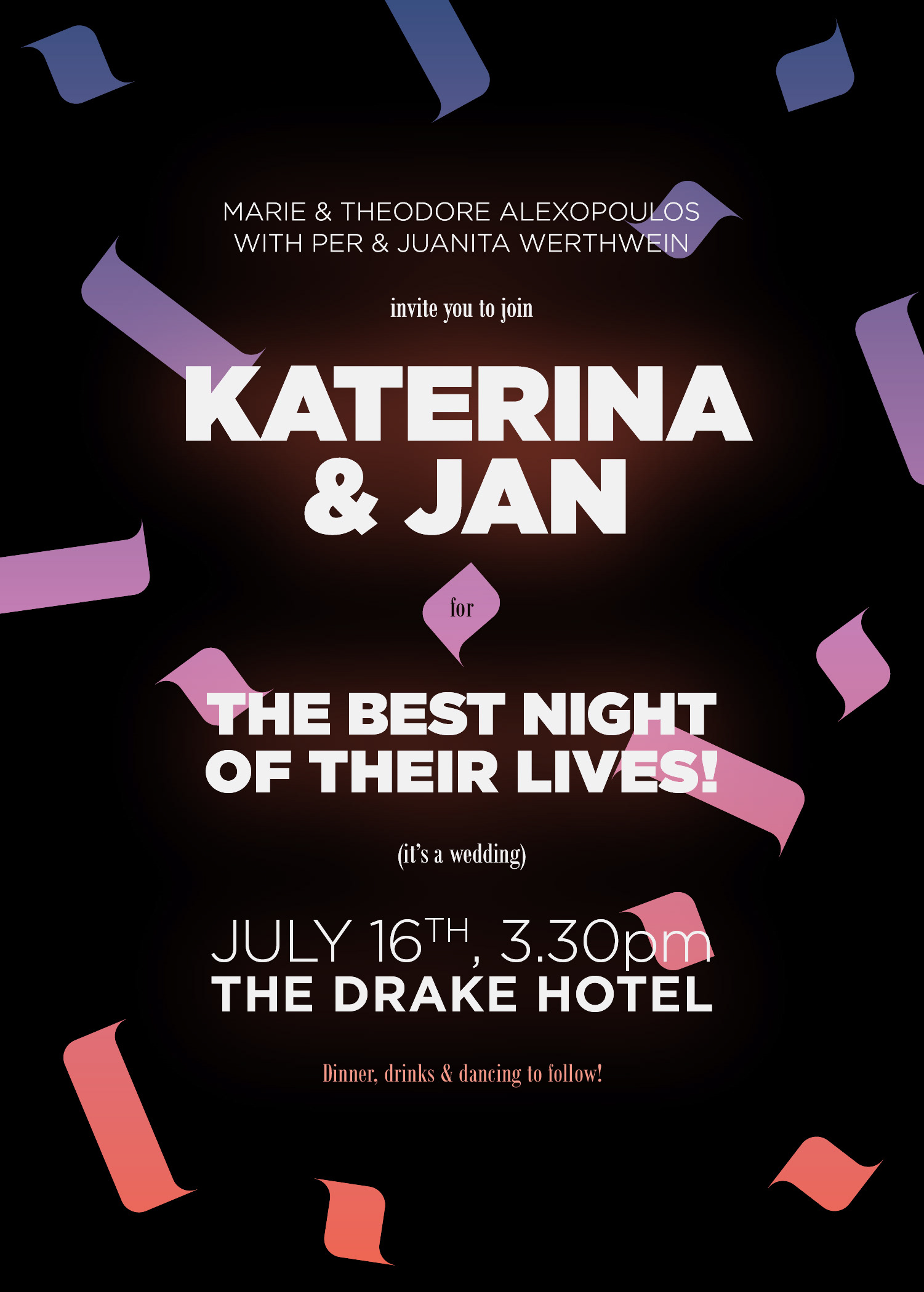
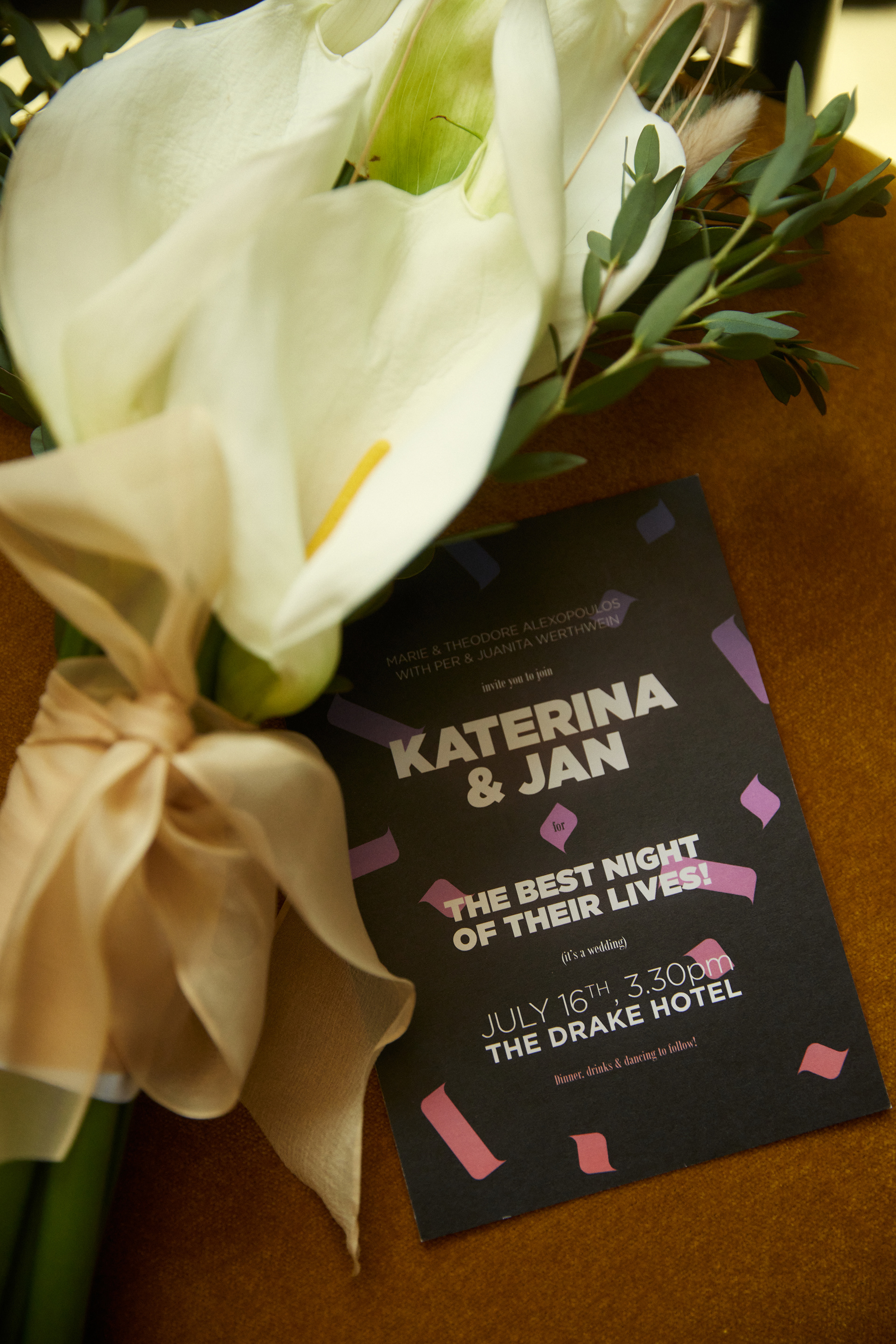
We wanted our invites to make a bang.
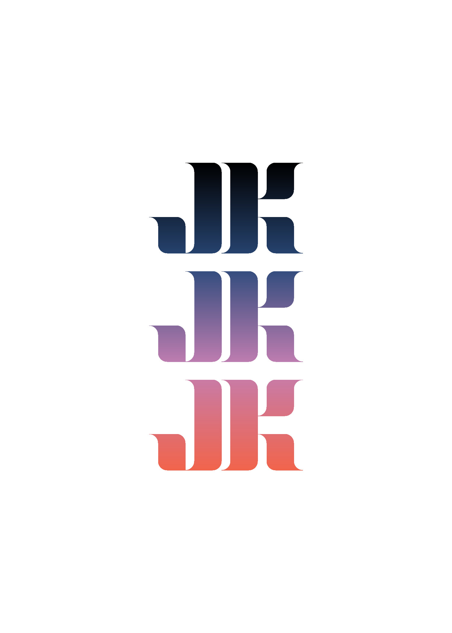
We used 3 logos on the front to represent the 3 of us (we have a pup), and the explosion of elements
to represent the atmosphere of a party.
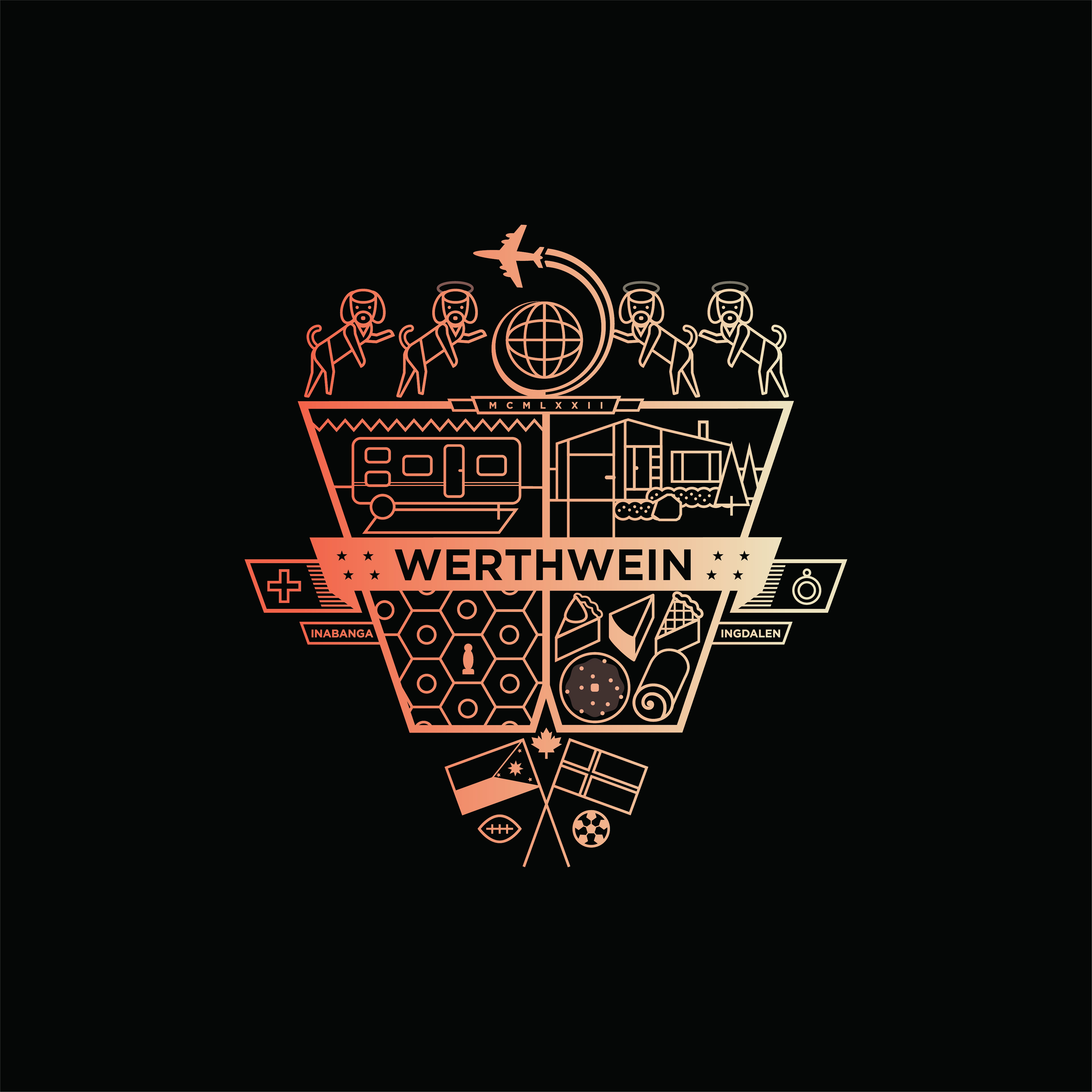
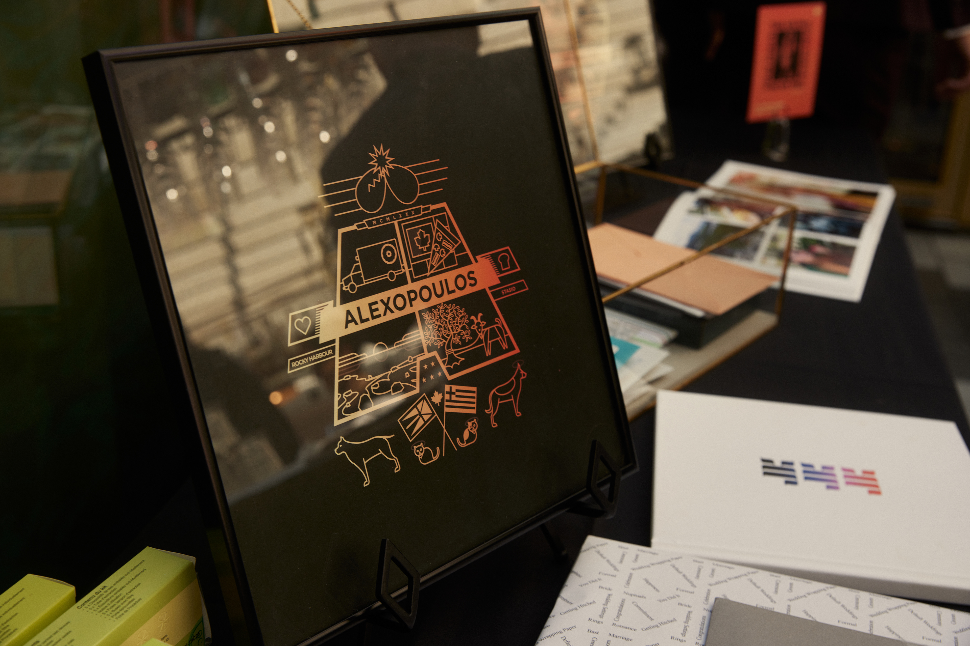
The Family Crests used a shape motif that utilised the first letter of the name. All the elements within represented fun family memories, crafts, pets and nationalities.

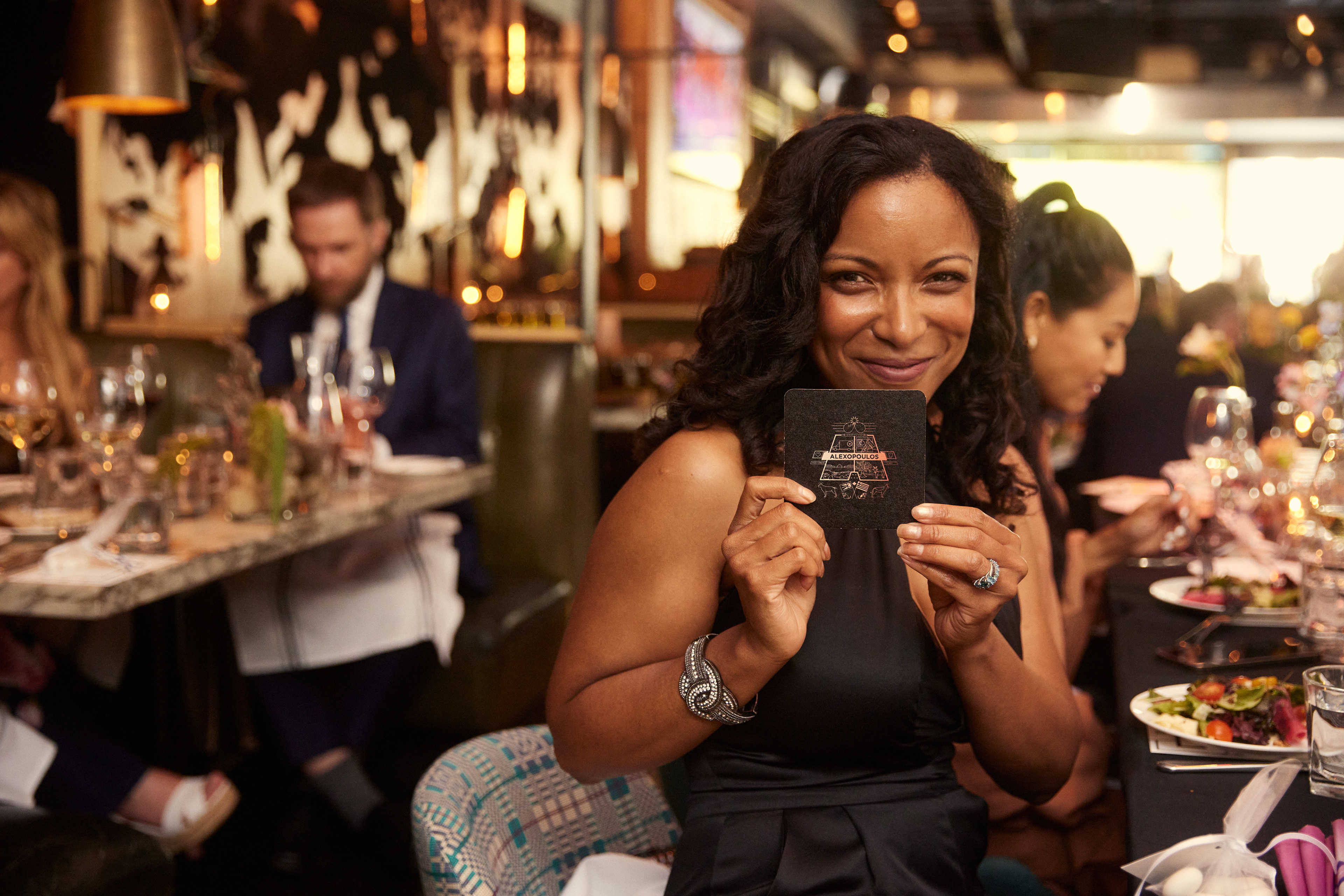
Need to zone out while a particularly boring speech lulls you into a coma? Do you like psychedelic glowing sky puppies? Why not gaze at one of our beautiful video loops!
Where wedding budgets go to die.
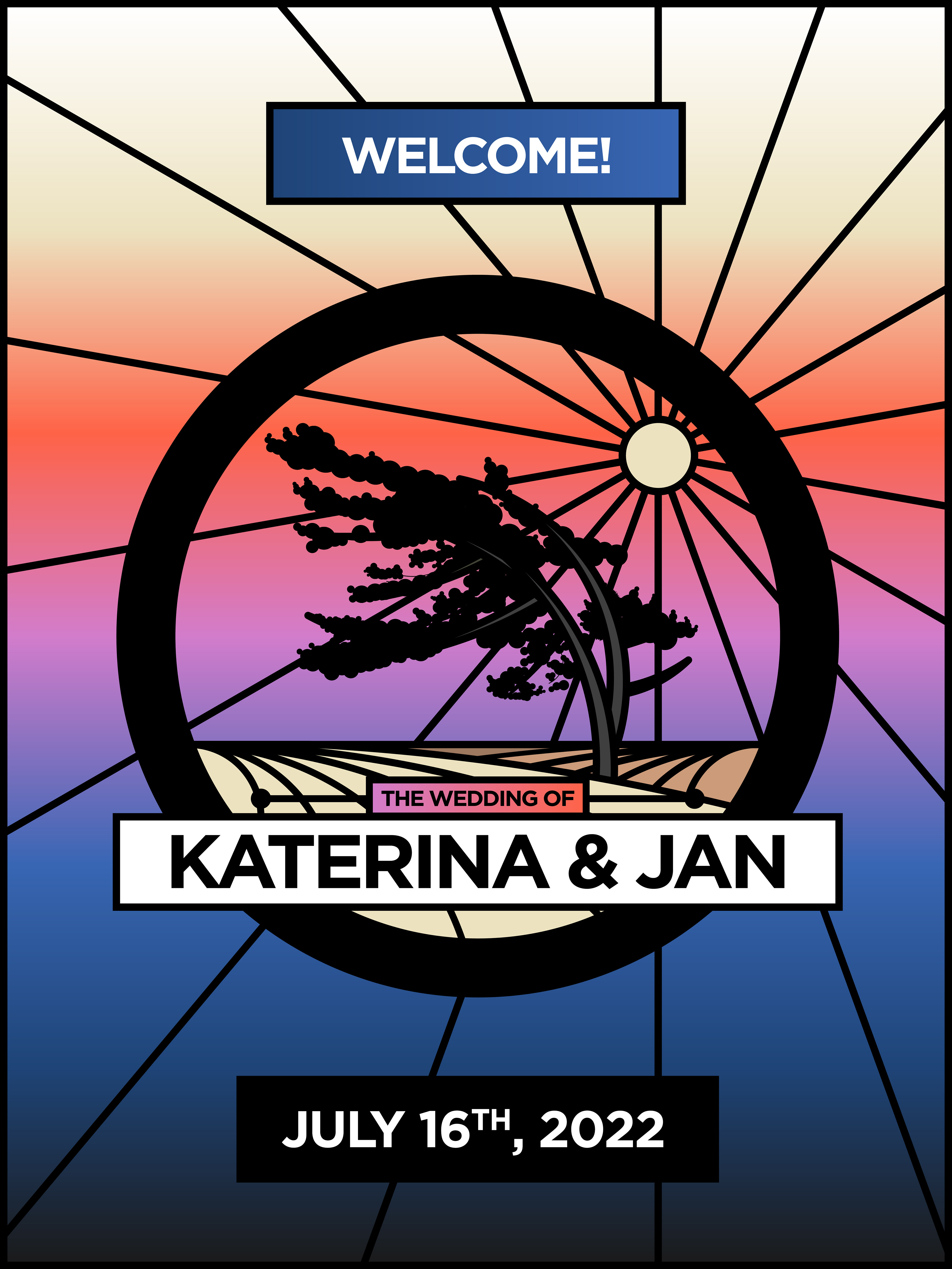
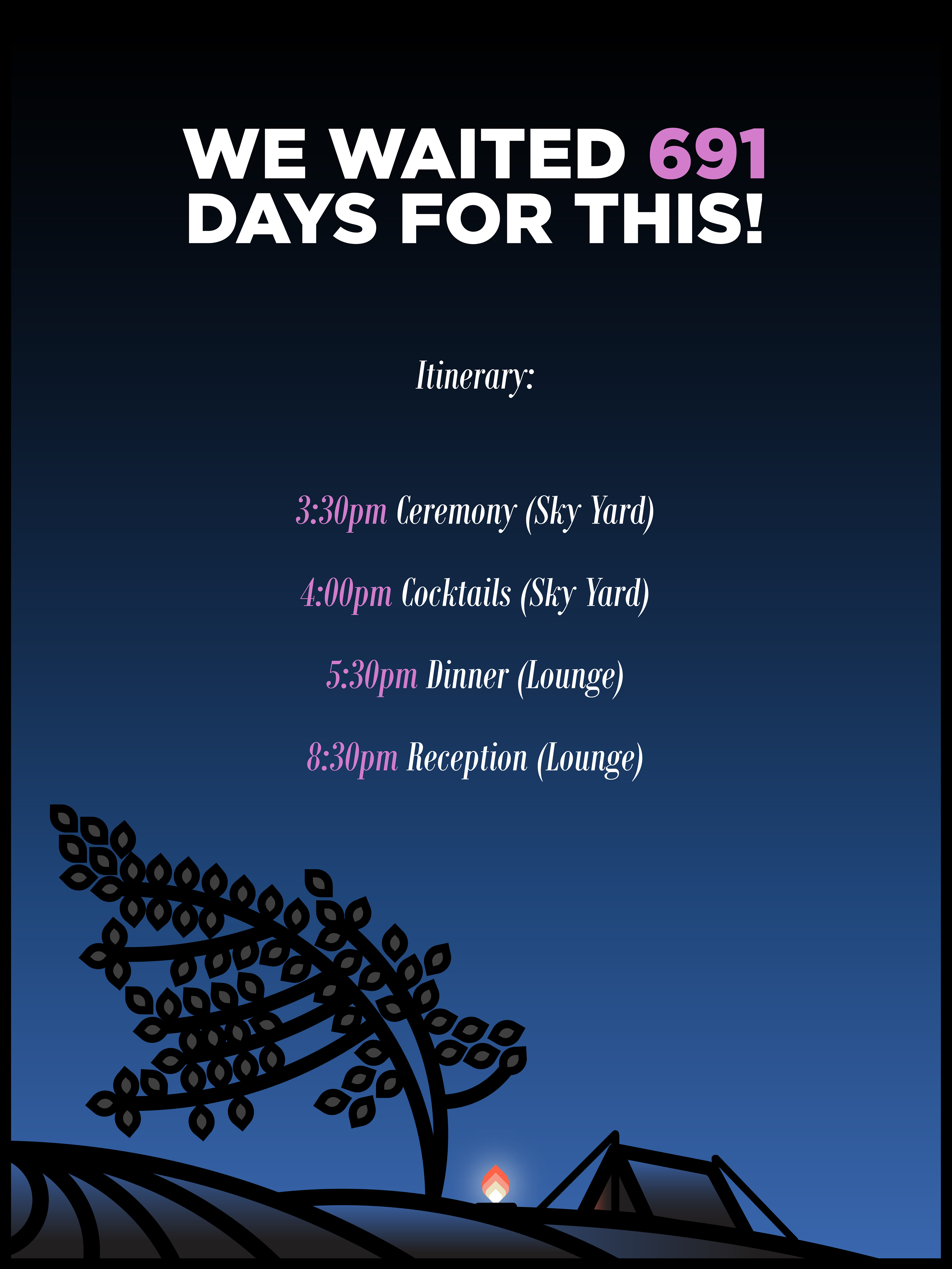
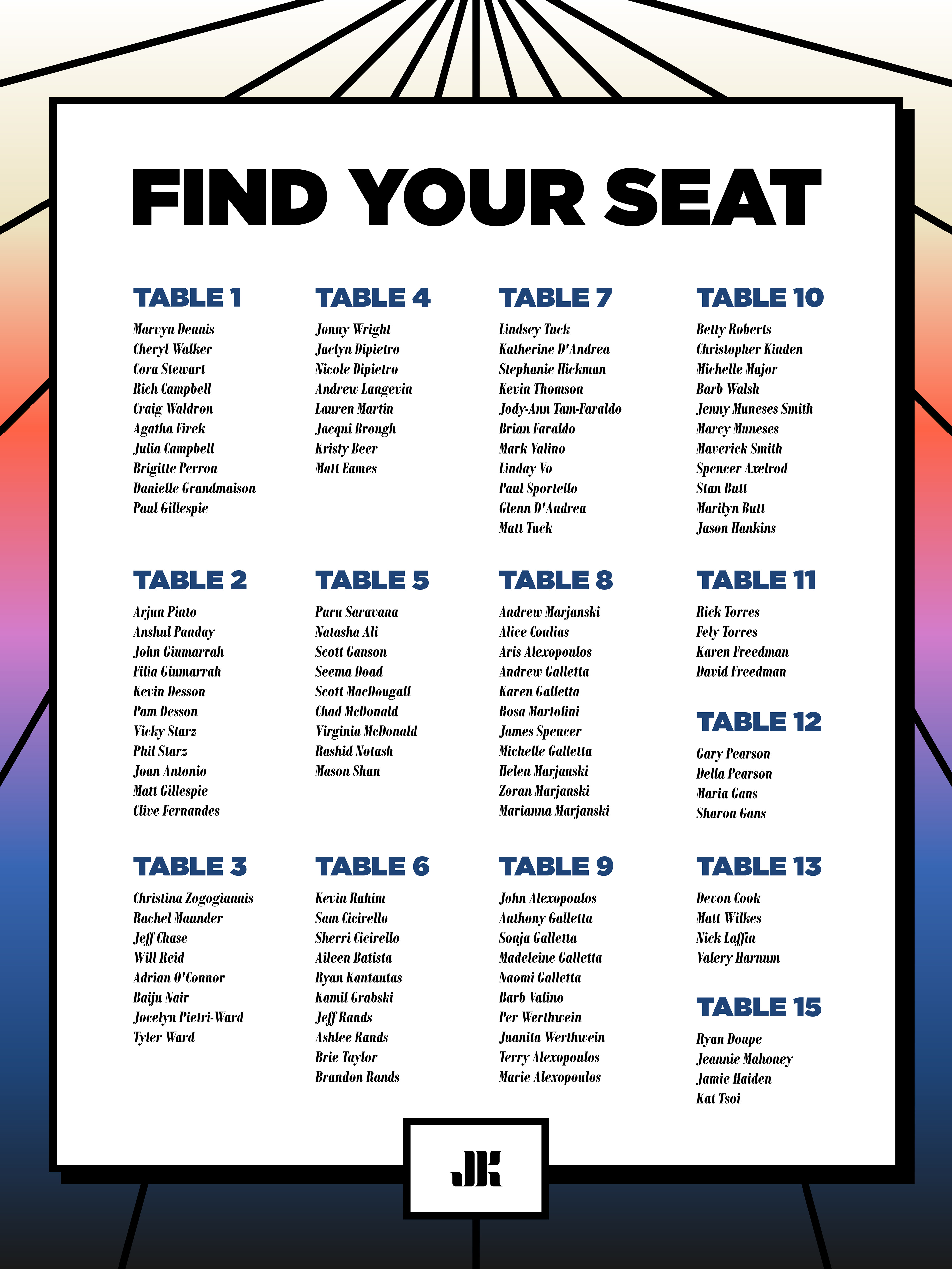






Pro-Tip:
When shooting on Super 8, try and get editors to shoot for you. They will edit in camera, which means
you won't have to edit at all!
( I love editing, but you know what I mean. It's time consuming)
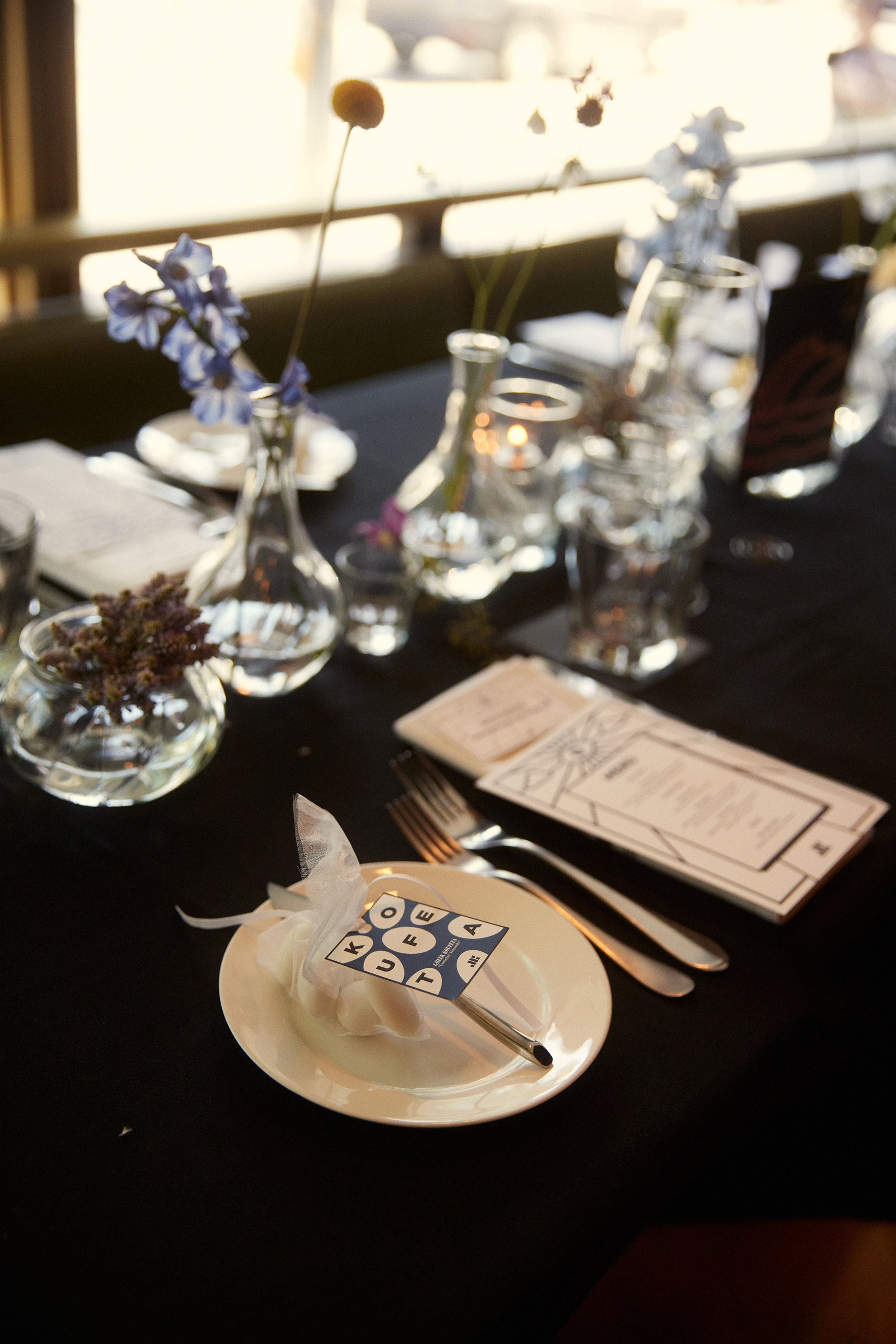
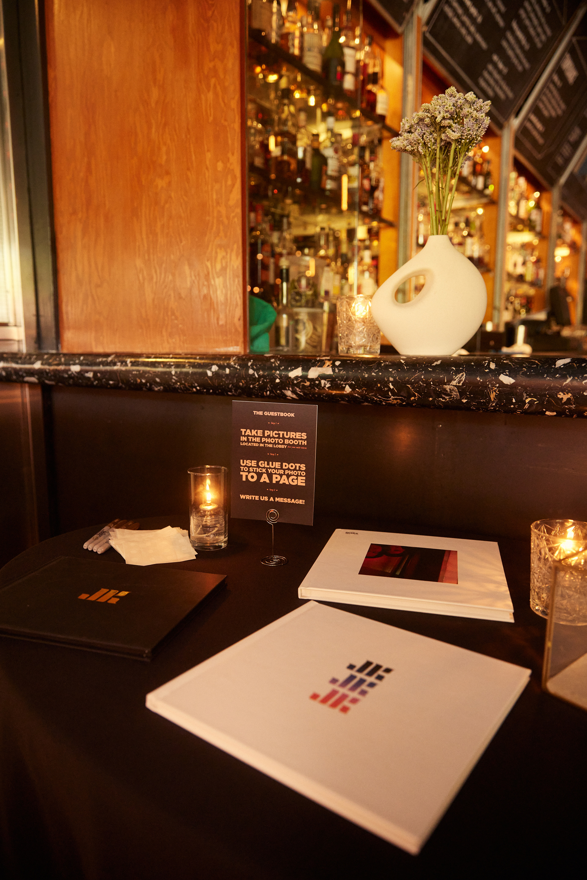
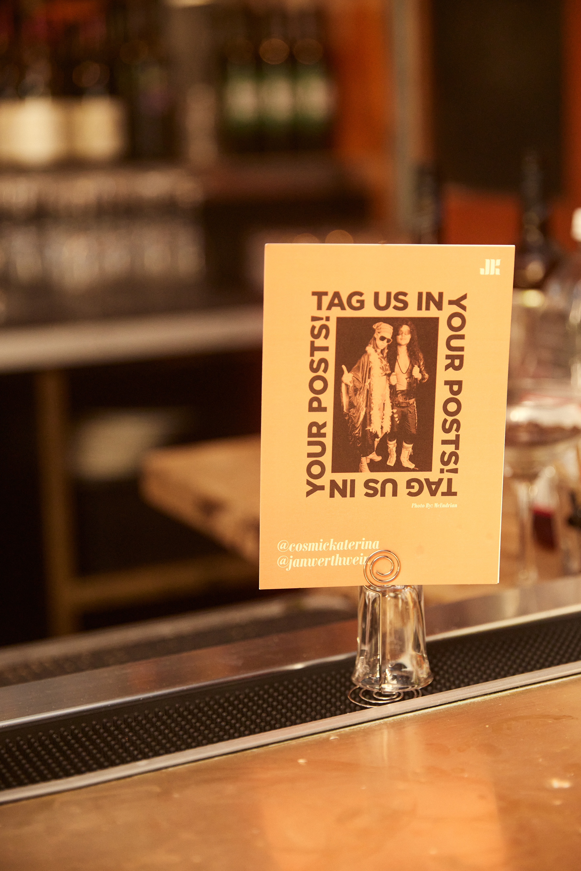
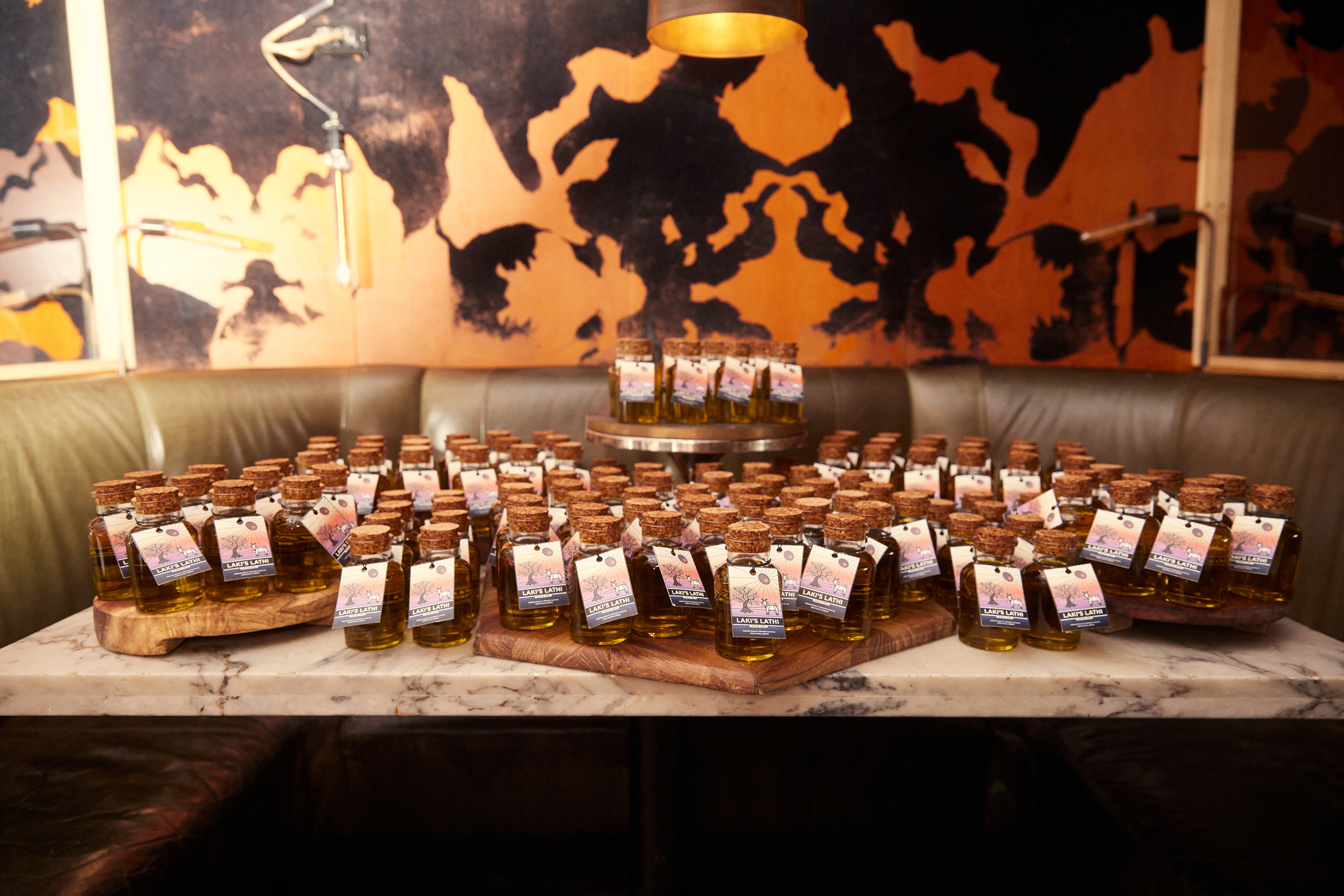
Pictured above: Wedding Essentials ^
Photo: Katherine Holland
All of the places, people, ideas and things that became our wedding invites.
