
LOCALITY POSTER SERIES
___________
| | | | | | | |
| | | | | | | |
| | | | | | | |
| | | | | | | |
| | | | | | | |
Each poster had to answer one question:
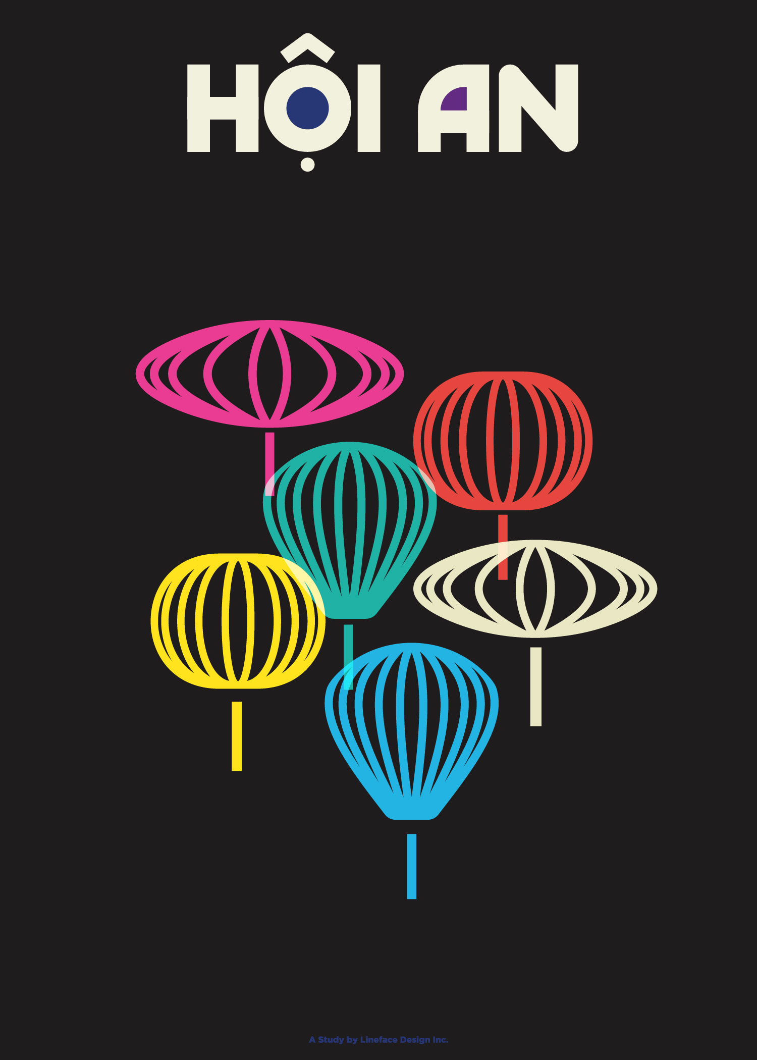
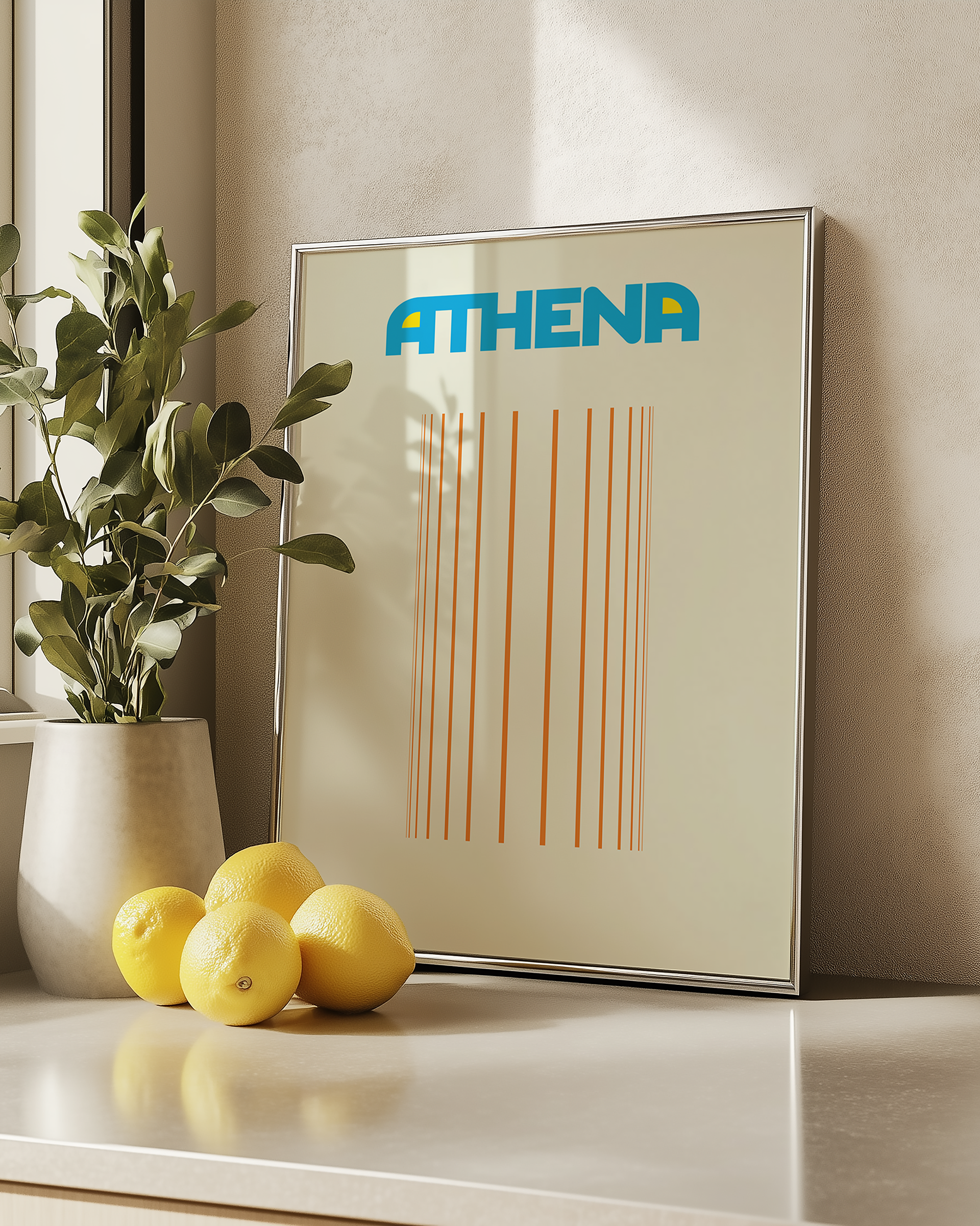
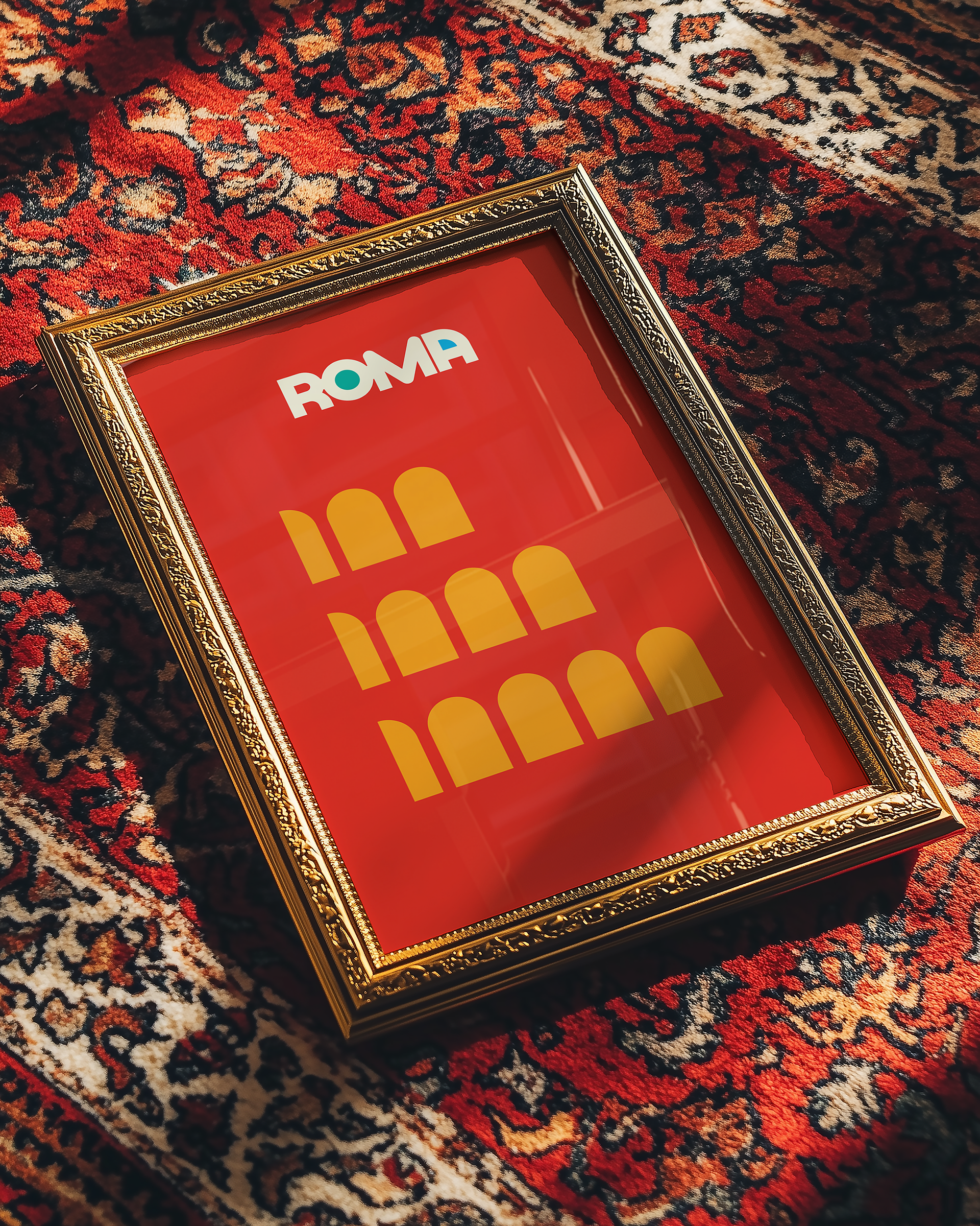
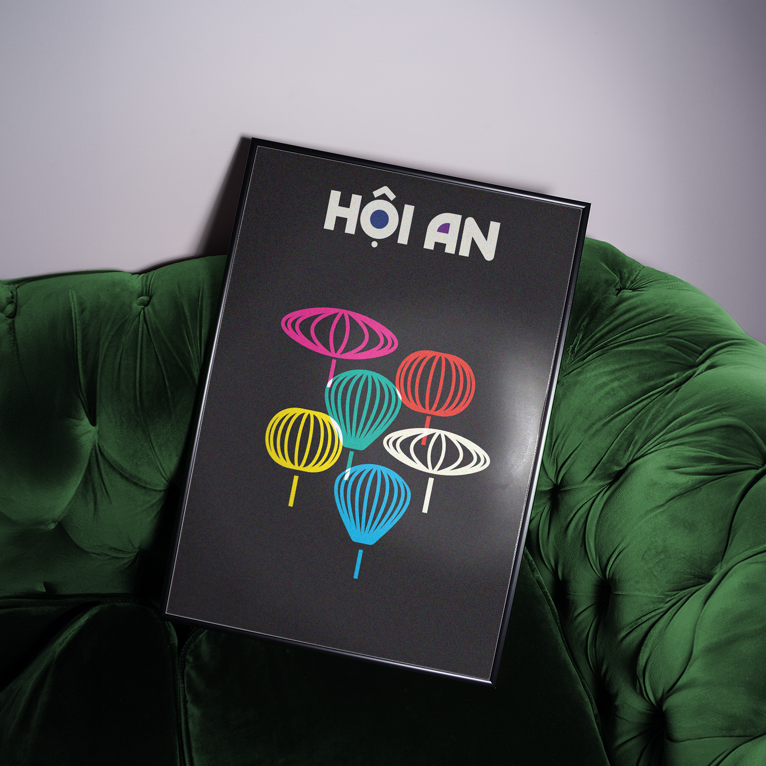
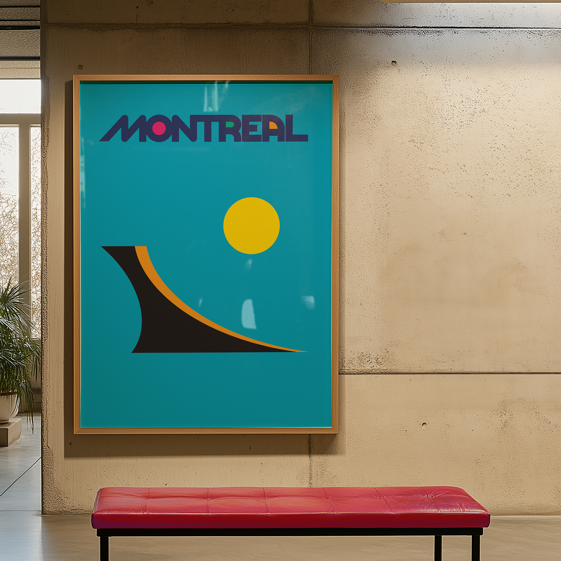
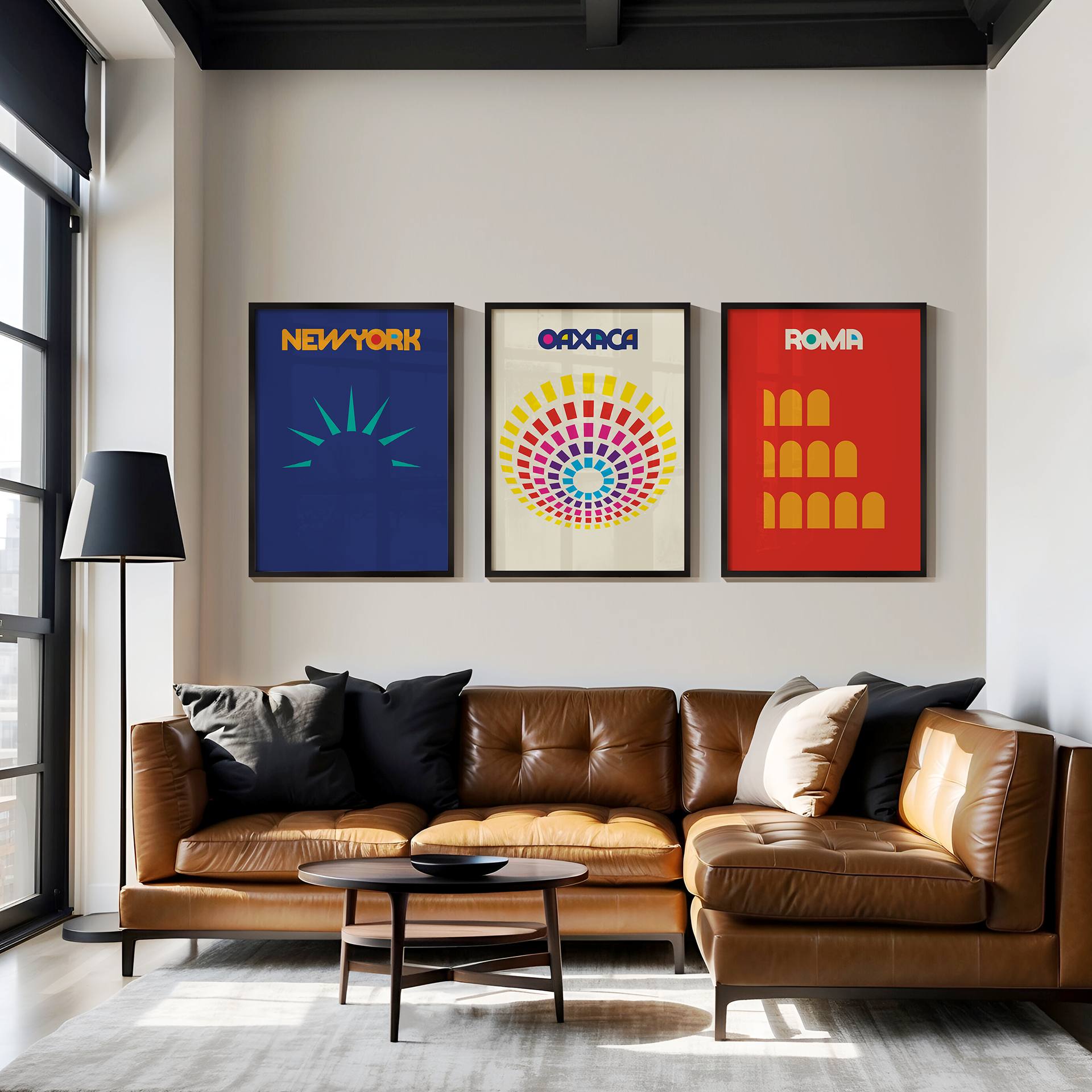
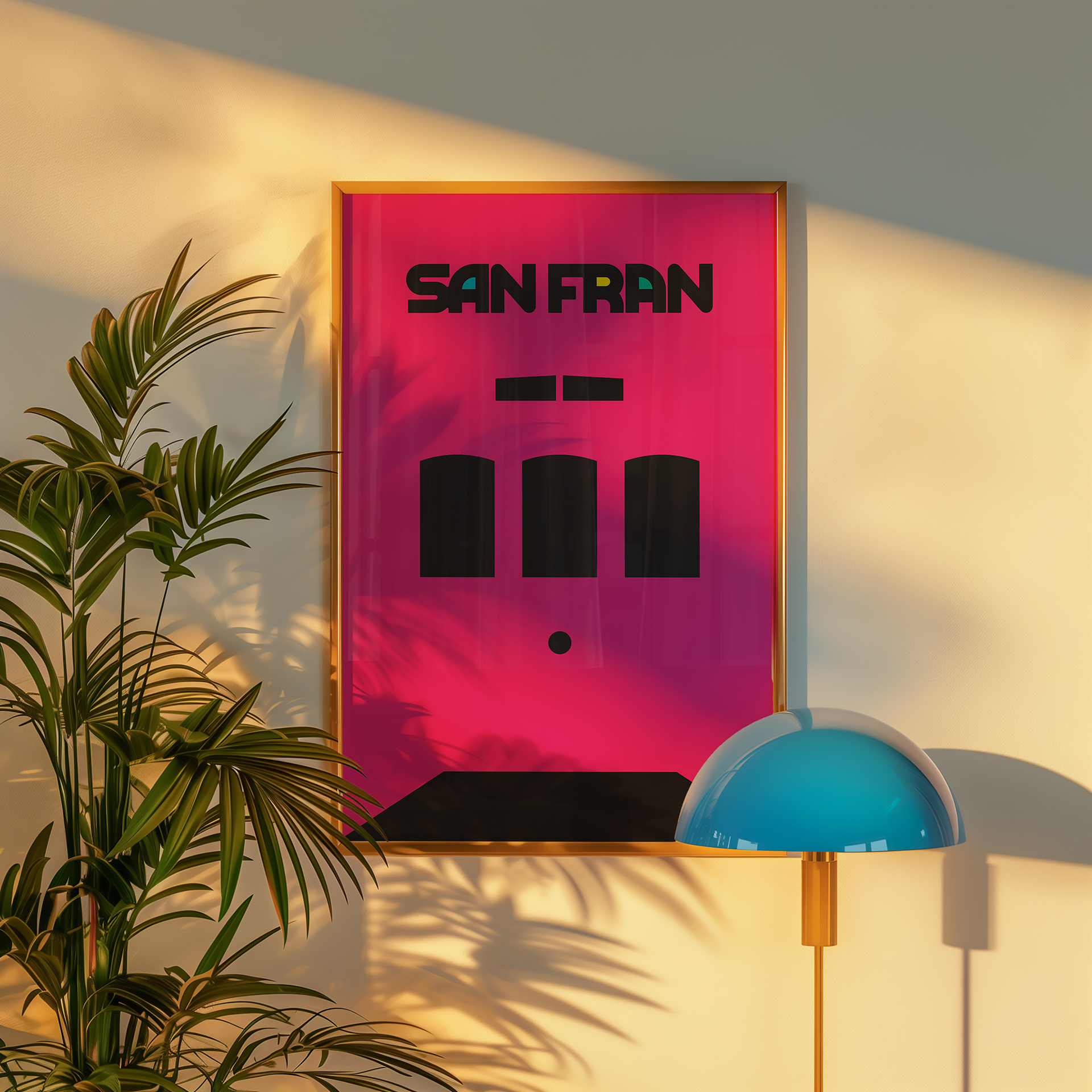
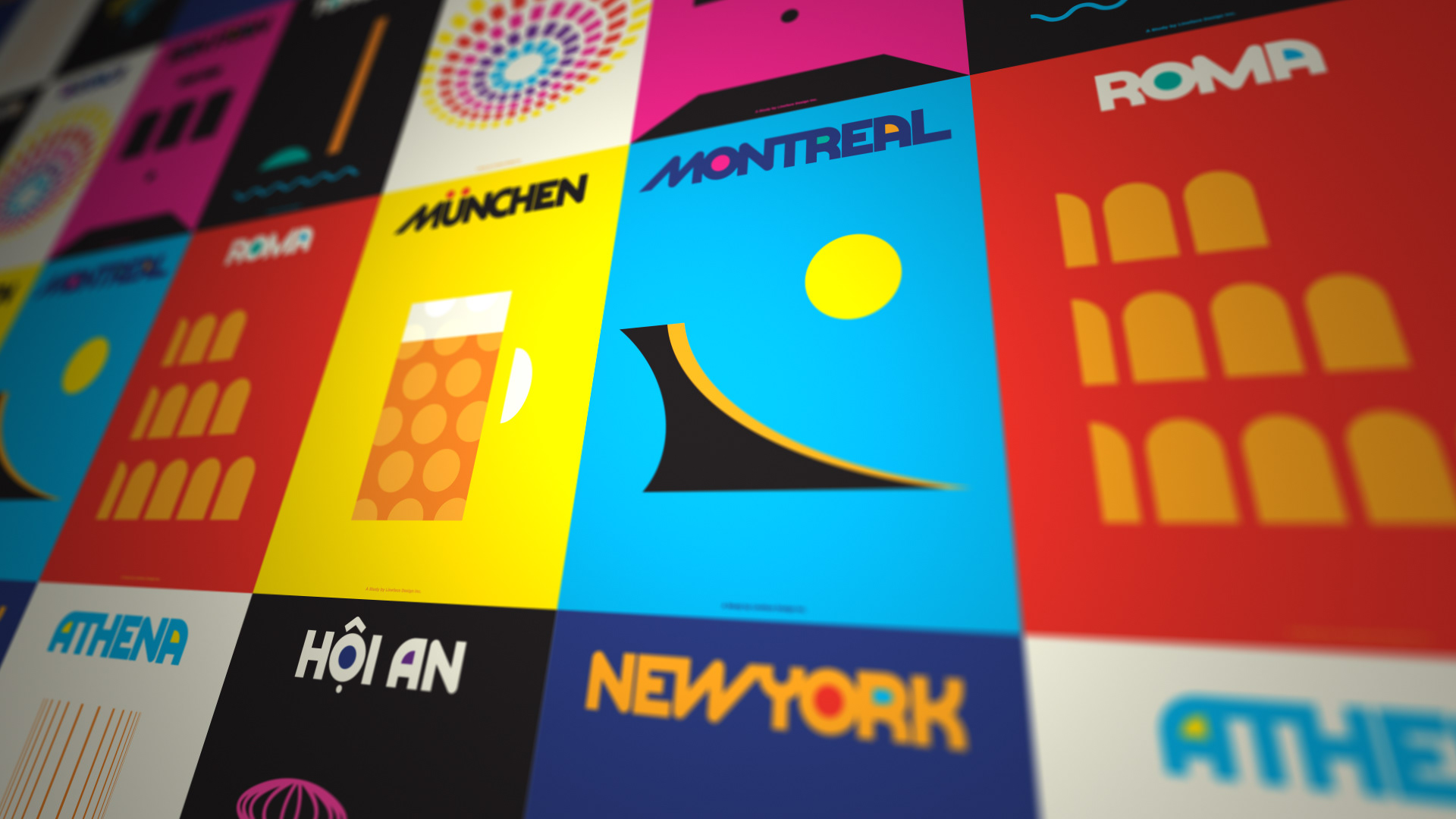
Can you recognize a city from a single shape or symbol?
Can you recognize a city from a single shape or symbol?
The goal was to reduce the complexity of a place into a single, compelling visual—a moment of instant recognition and emotional resonance. At the same time,
the series served as a creative sandbox to:
-Explore typography and layout systems
-Celebrate design as storytelling
-Reinforce Locality’s belief that design is a tool for economic and cultural connection
Minimal Form, Maximum Impact:
The process was guided by three design principles:
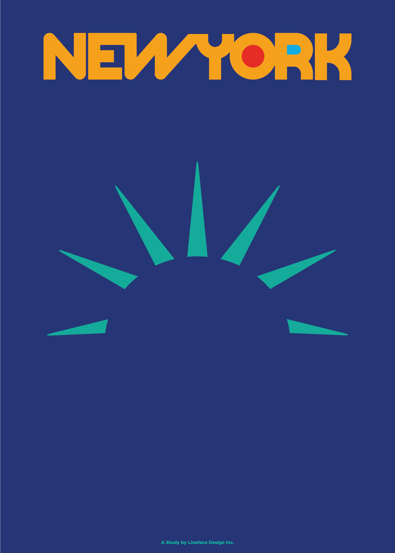
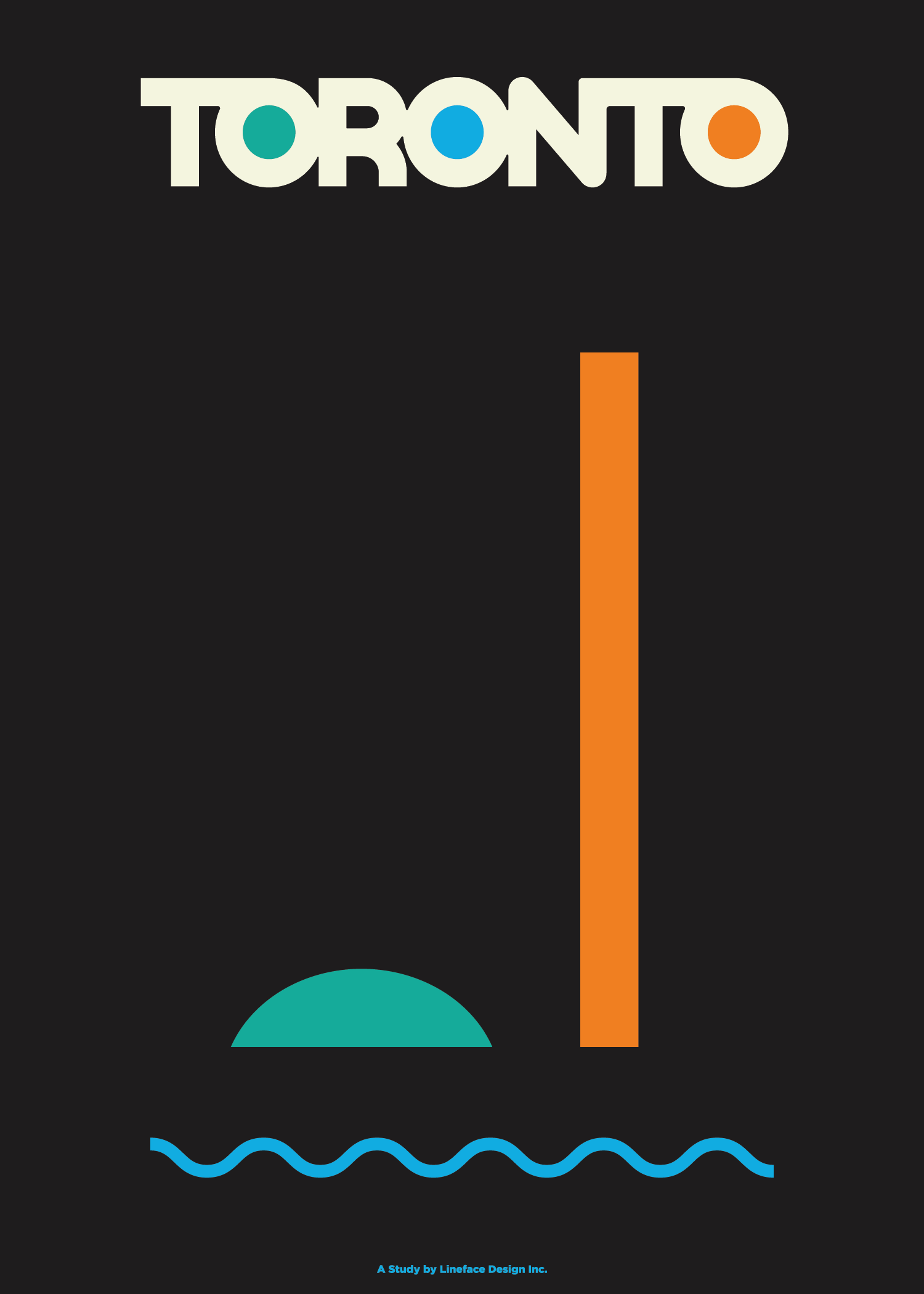
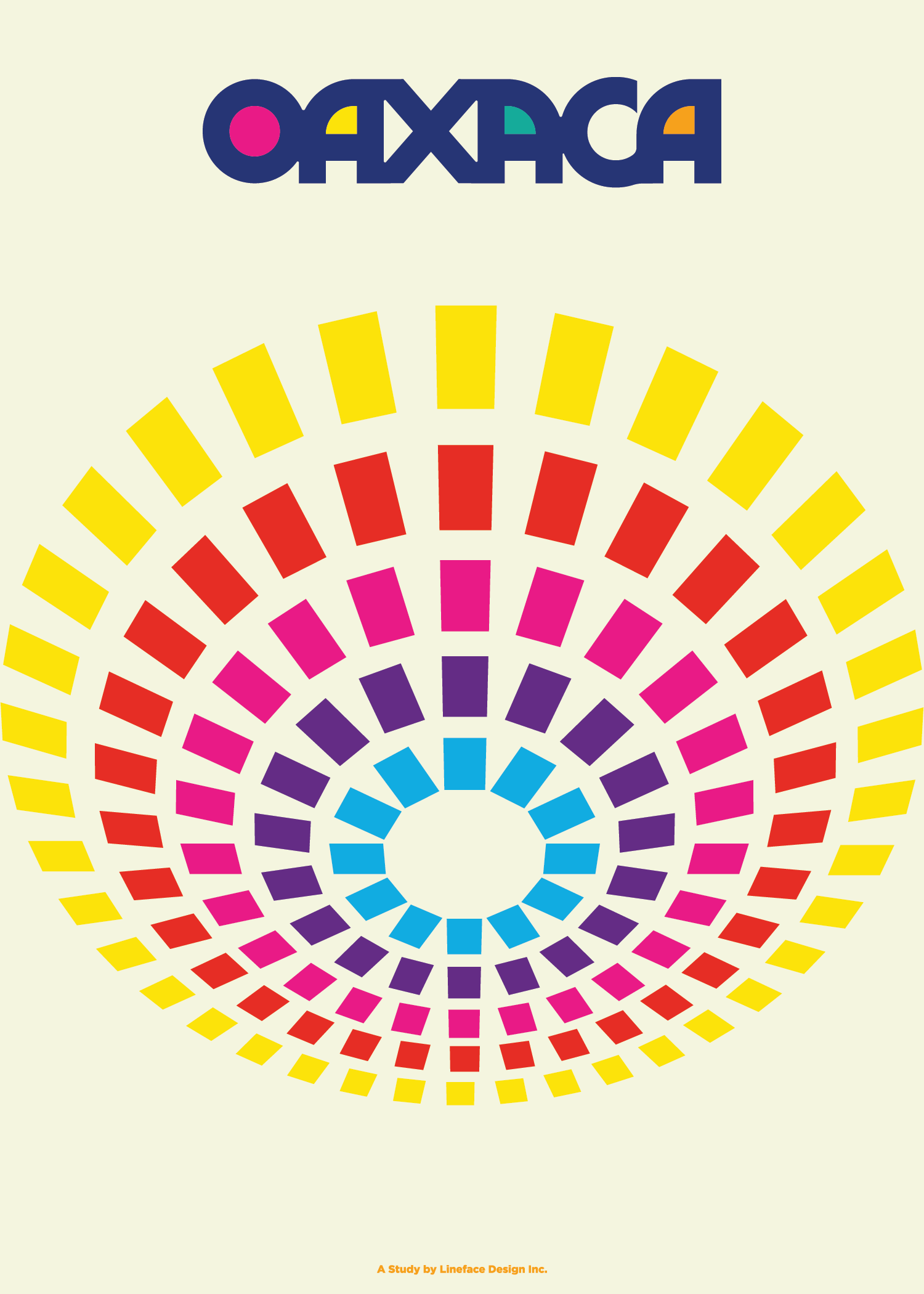
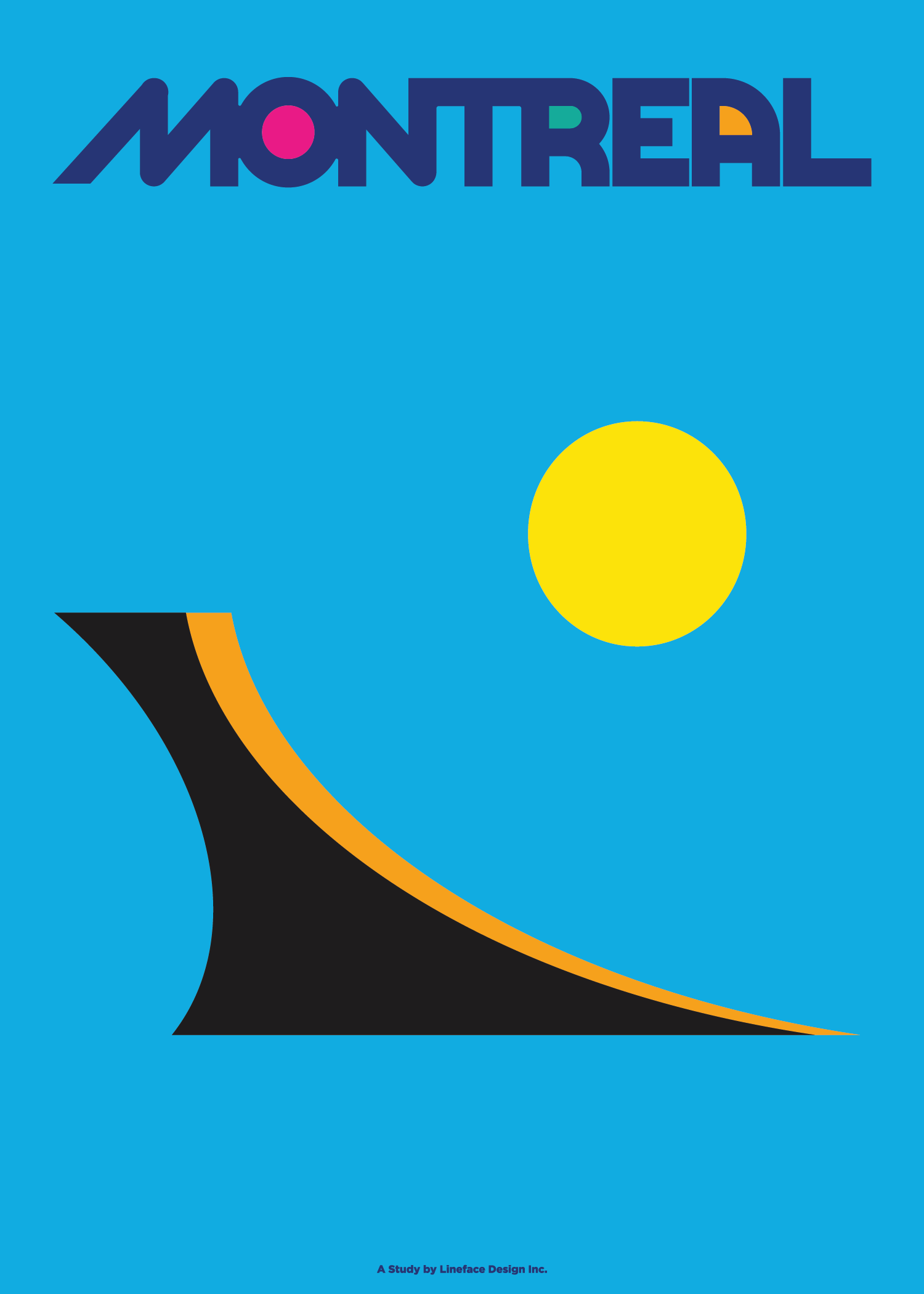
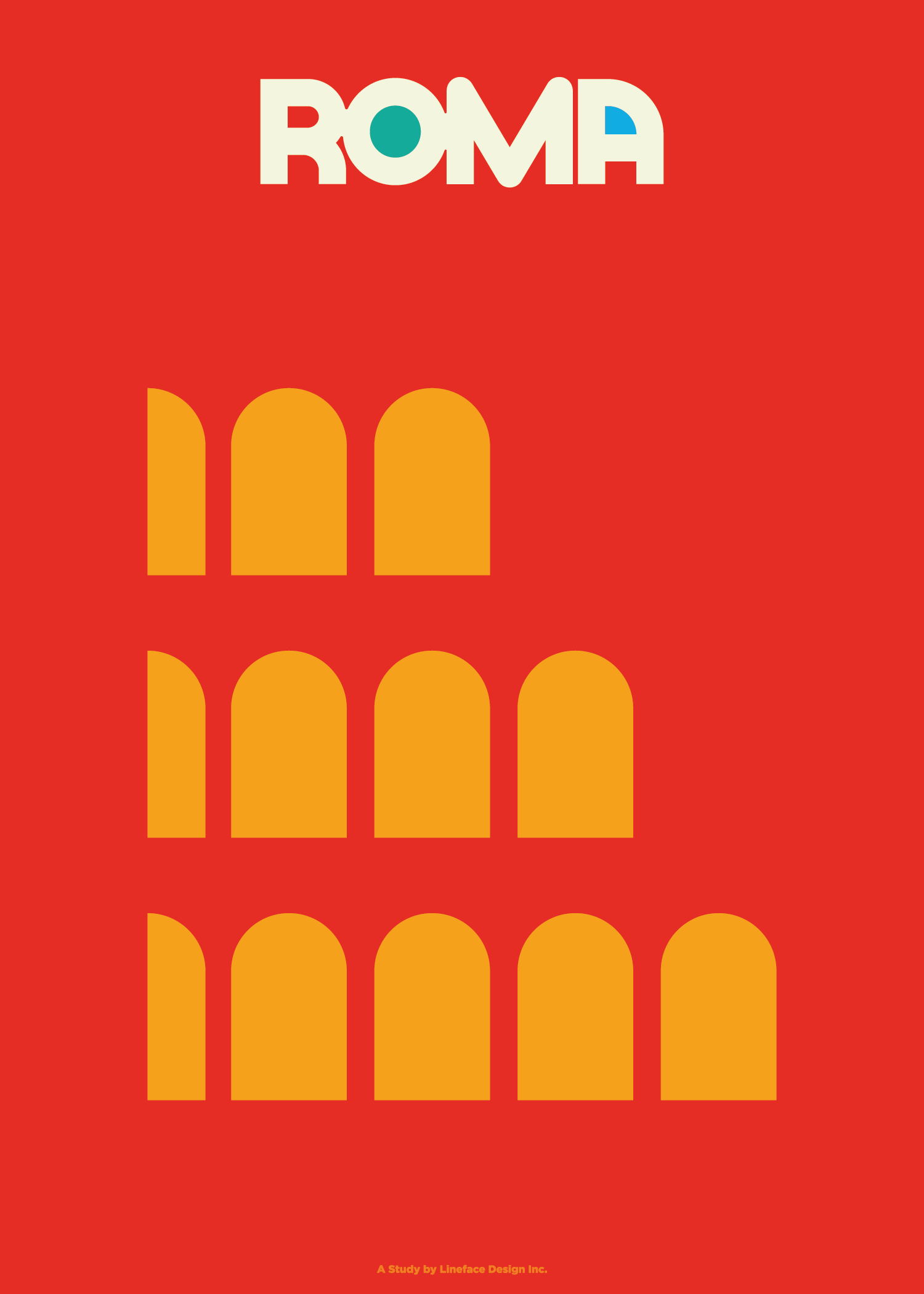
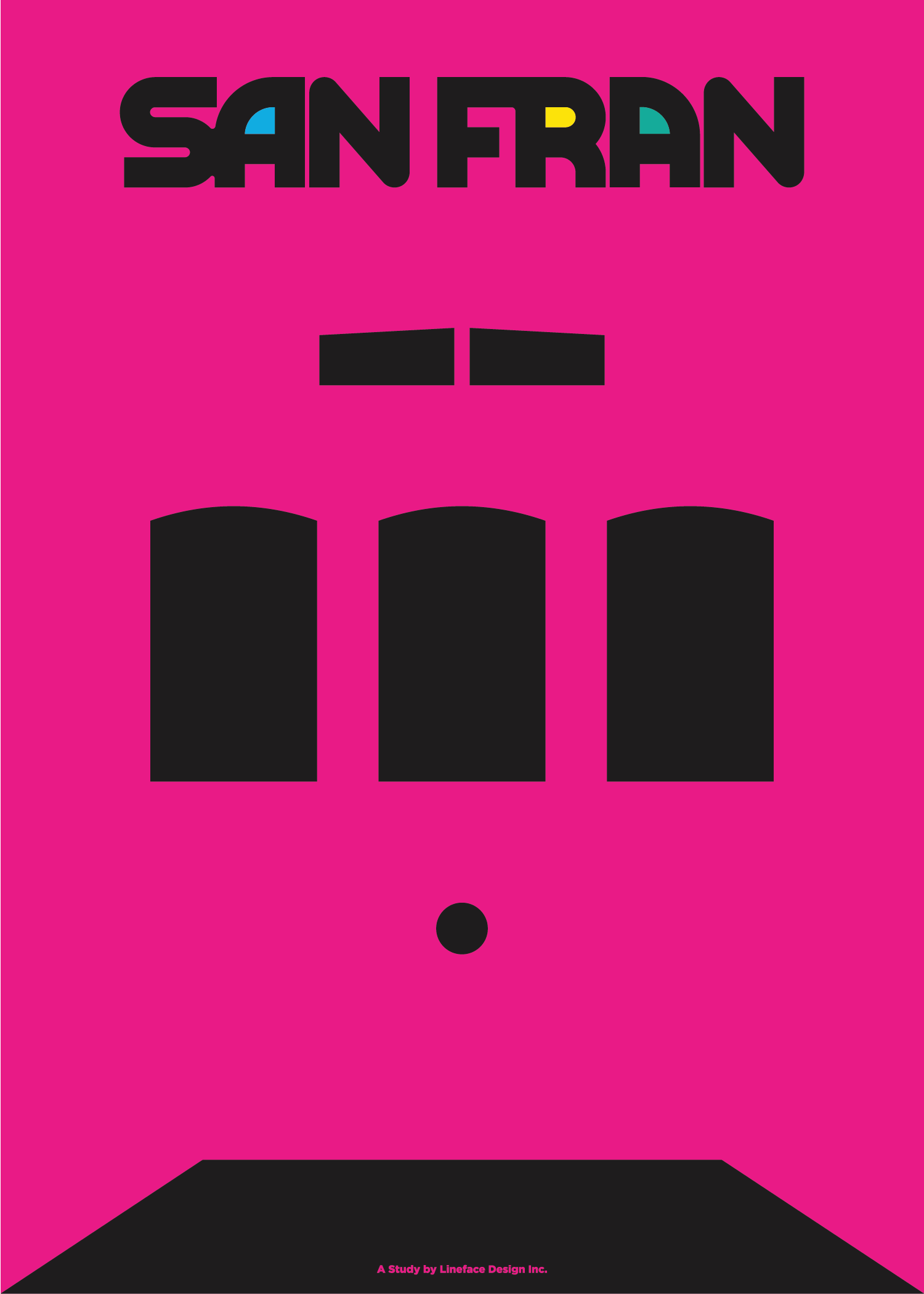
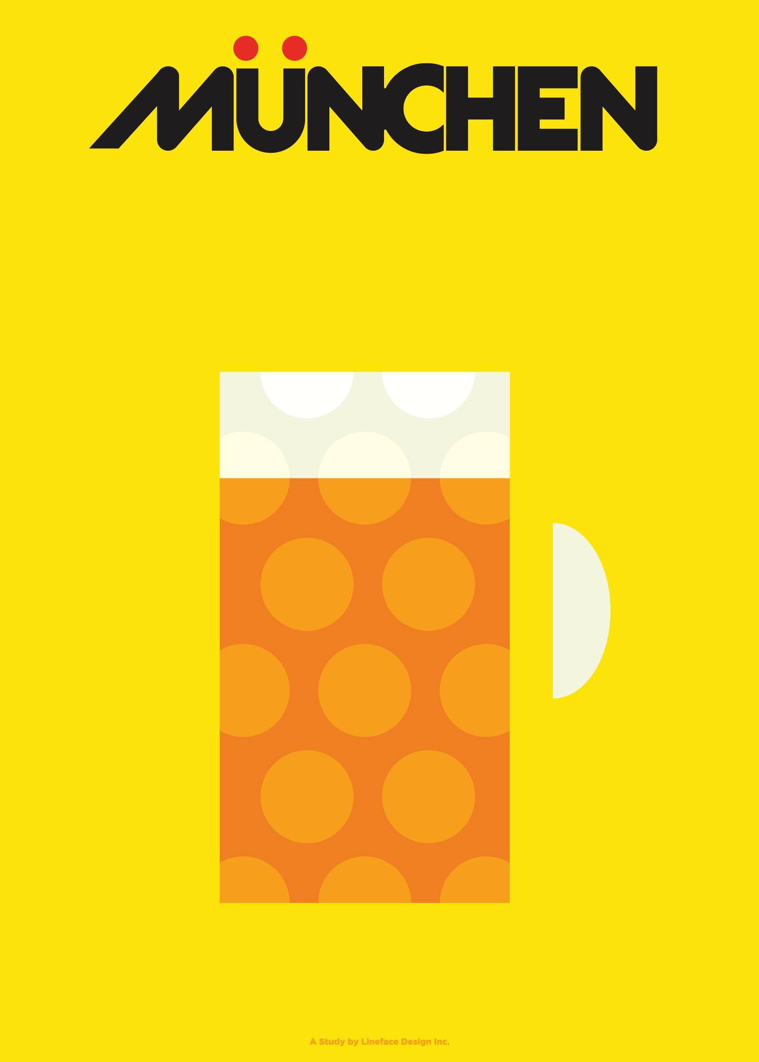
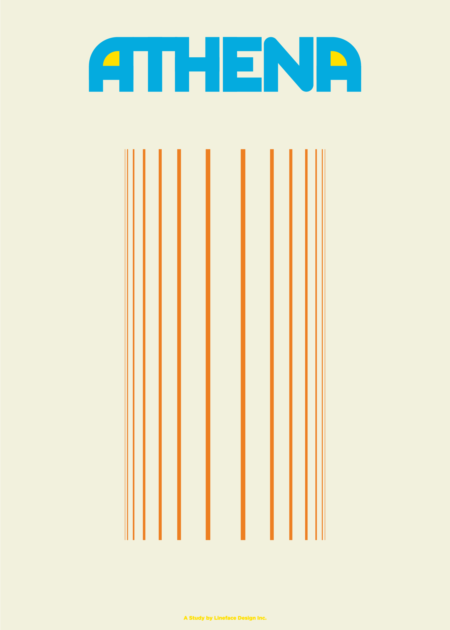
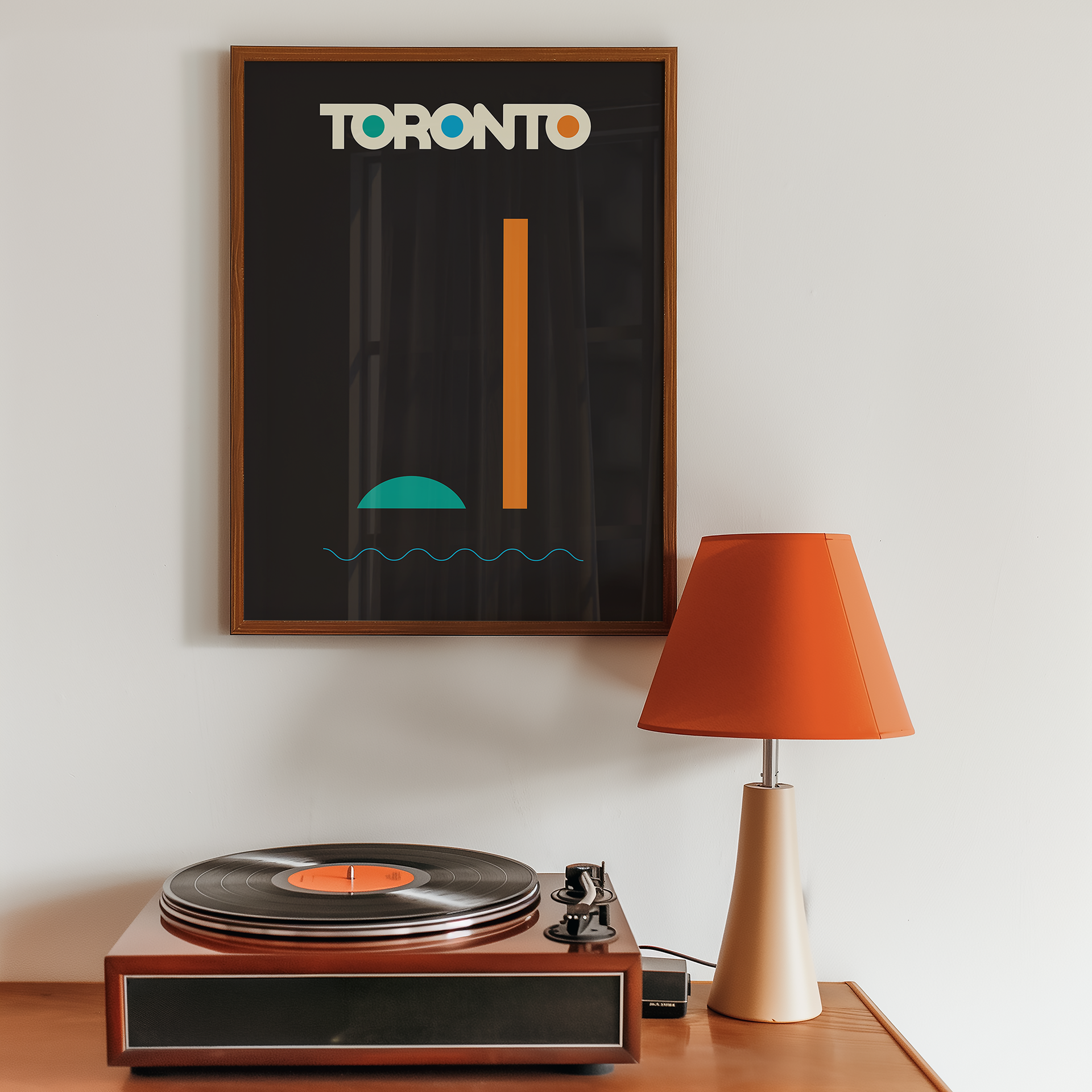
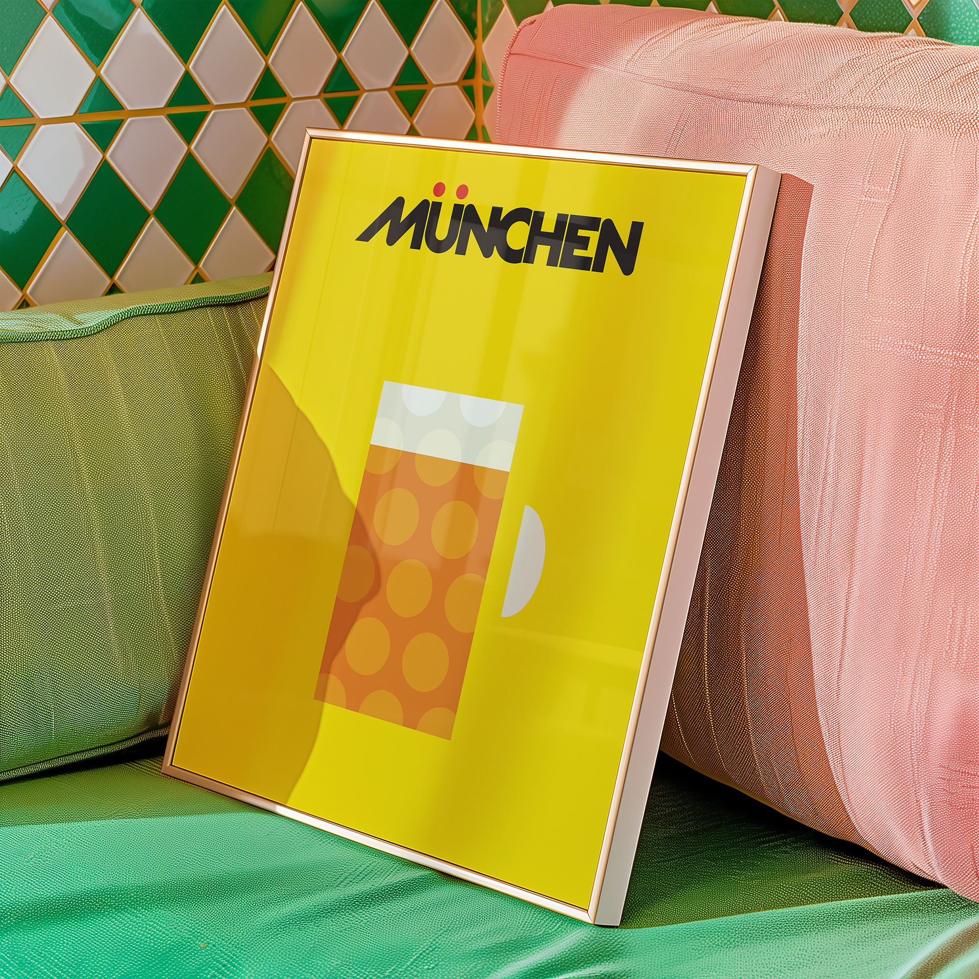
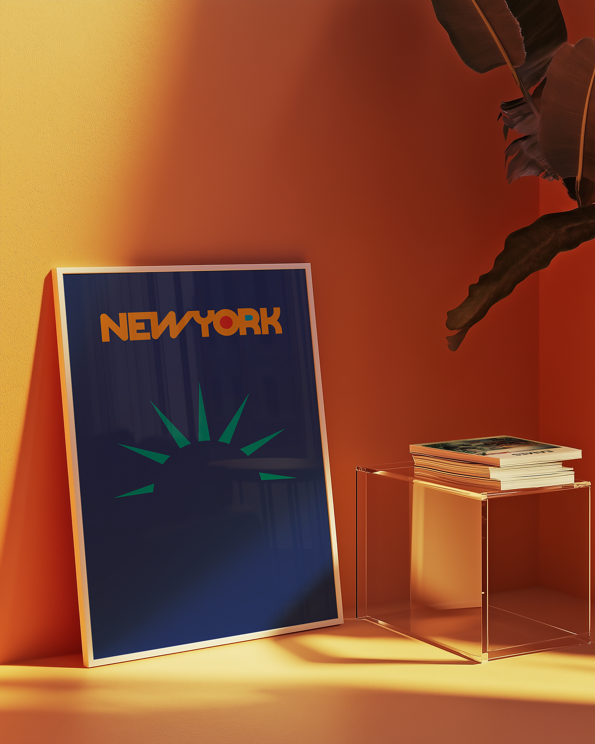
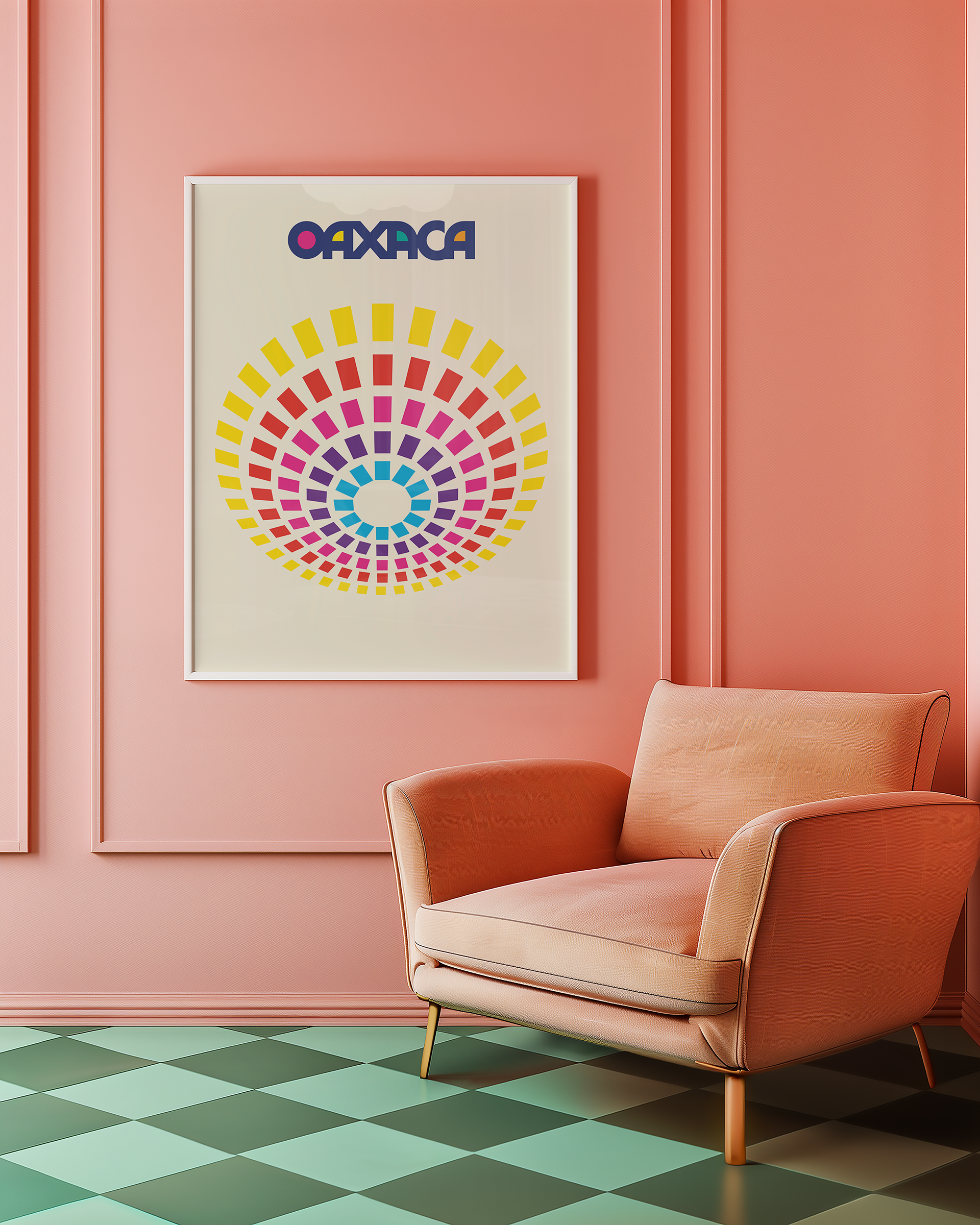
Simplicity: Each poster uses strong geometric shapes and bold colour blocking to convey the essence of a place without clutter or overthinking.
Recognition: Every poster features an iconic, hyper-local visual reference—something residents will recognize immediately, and outsiders may grow curious about.
Typography as Character: Fonts were chosen to reflect the tone of each place—playful, industrial, elegant, or classic—creating a visual voice for each city.
This series served several outcomes:
An internal creative exploration that reaffirmed our team’s love of smart, intentional design
A visual proof of concept for how cities can tell their stories simply and boldly
A celebration of local identity that aligns with our core mission: to help communities see their value, and share it with pride
THANK YOU
For digital or physical prints visit:
___________
| | | | | | | |
| | | | | | | |
| | | | | | | |
| | | | | | | |
| | | | | | | |
